Assignment: Evaluate the Design Comm course. Talk about its successes and ways to improve the course.
This was probably my favorite DesComm course I've had yet. It wasn't just about drawing and sketching and rendering. This time it was about presenting as well. That's an area I've struggled at for a long time, and I really believe I've gotten better at it thanks to my teacher and his curriculum. The only thing I would have liked would have been more feedback from my teacher on how I did at my assignments. I got a lot of great feedback from my classmates, but they don't have the same experience he does.
Thursday, December 2, 2010
Tuesday, November 30, 2010
DesComm - Housewares Design
Assignment: Design an innovative product or experience that brings a popular food trend into the home kitchen. It could be a professional technique, a cultural food trend, or an environmental improvement. The design can refine an existing product or be something completely new to the kitchen environment. It should be portable and consider both functionality and aesthetics in its execution. Read the complete rules at the IHA website.


DesComm - Blogging
Assignment: Evaluate the use of a blog as a communication tool about design.
I've enjoyed using a blog as a way of communicating with my peers. Its interesting to read their opinions on things and see where they are coming from on stuff. I like that we all post our projects online for each other to see. As for changing the world with our ideas, I don't think we are there yet, but you have to start somewhere. This format gives us practice at getting our thoughts across. I also really like that with a blog I have the ability to do the assignment when I have the time. Sometimes my class schedule just gets packed down and I would have a hard time squeezing in a free writing assignment. This format allows me to do them when I've got a few minutes waiting for something or carve out a larger time to do them all. I feel like I'm able to put more thought into them because they aren't due on a certain day at a time. I hope my classes in the future continue to use blogs as a presentation or recording format.
I've enjoyed using a blog as a way of communicating with my peers. Its interesting to read their opinions on things and see where they are coming from on stuff. I like that we all post our projects online for each other to see. As for changing the world with our ideas, I don't think we are there yet, but you have to start somewhere. This format gives us practice at getting our thoughts across. I also really like that with a blog I have the ability to do the assignment when I have the time. Sometimes my class schedule just gets packed down and I would have a hard time squeezing in a free writing assignment. This format allows me to do them when I've got a few minutes waiting for something or carve out a larger time to do them all. I feel like I'm able to put more thought into them because they aren't due on a certain day at a time. I hope my classes in the future continue to use blogs as a presentation or recording format.
Monday, November 29, 2010
Typography - Poster Project
Assignment: Create a 16 × 20 inch poster for the MidPoint Music Festival 20XX in Cincinnati. The text and the MPMF graphic identity assets are provided on the class workspace. Carefully consider the typographic hierarchy of the information presented. A viewer should be able to easily understand the calendar of events and to quickly learn who the featured performing acts are. The poster must also convey the excitement of contemporary indie and art rock to an audience of designers and students. The information itself must constitute the “imagery” of the poster. Your poster must be purely typographic. You may use colors, shapes, and lines as well as text, but no illustrations or photography.
Our class didn't get to this project this quarter, but I wanted to keep the assignment included so I might come back to it at some point. The examples were all really cool.
Our class didn't get to this project this quarter, but I wanted to keep the assignment included so I might come back to it at some point. The examples were all really cool.
Tuesday, November 23, 2010
DesComm - Personal Evaluation
Assignment: Evaluate your work this quarter and list your goals for the next quarter.
I believe I've improved my skill set and my work has been good. It's definitely not the best in the class, but I hold my own. I've got plenty of room to grow and peers to look up to.
Next quarter is winter quarter and I'll be on co-op with Swimways. My goals for then are to learn all I can about chairs. Spring quarter's project is the famous Chair Project so I want to hit the ground running. Swimways is looking to expand their camping line, so hopefully I'll get some useful knowledge about chairs and other foldable, portable furniture. I also want to update my website and portfolio to include this quarter's projects. I'm quite proud of both my Baby Food Processor and my main studio project. As a general goal, I want to get even better at Photoshop and Illustrator, and page layouts, and of course, sketching.
Monday, November 22, 2010
Typography - Specimen Sheet
Assignment: Typeface designers have a long-standing tradition of creating “specimen sheets” of their new fonts so printers and designers can see them in action. A good specimen sheet shows the flexibility and expressive range of the typeface family while capturing its distinct spirit and tone of voice. A good specimen sheet also highlights the most unique functional aspects of the face and displays its full range of weights, styles, characters, and special glyphs in a wide range of sizes.
Create two 11 × 17 specimen sheets for one of the following typeface families: Gill Sans Std, Sabon LT Std, Helvetica Neue LT Std, Baskerville Ten OT, Futura Std, Clarendon LT Std, or Bodoni Std (all provided). The first specimen sheet must include: (1) the “style block” with many styles and weights represented and labeled. Keep in mind that the “style block” should utilize some kind of related text, like a quotation or poem, or a set of words that surround a topic relevant to the typeface’s character or purpose. It is a chance for the specimen designer to show off personal style, topical knowledge, or aesthetic taste. The second specimen sheet must include: (2) the full character set including ligatures, lining & oldstyle figures, small capitals, and (3) a sample text set at several sizes, weights, and line spacings (see examples below).
This assignment shows what can be done with just a single font. I decided to use Times New Roman because I absolutely hate the way it looks. This exercise show all the different way the font can look and I like most all there options I came up with. I used bold, italics, small caps, all caps, and narrow width in various combination. I considered using wide as well but I already had enough variables to do the entire poem without repeating anything. I found I really like how the all caps and the small caps lines look, they are very formal. The italics look almost fun and a tad playful in this font. I still really don't care for the normal plain version of the font, but it was an interesting exercise. I'll remember that changing these attributes really changes the font next time I'm looking for that perfect font for a project.

Thursday, November 18, 2010
DesComm - Open Post
Assignment: Write about whatever you want relating to home, school, work experiences, or something else that could be applied to design.

Recently, Barnes and Nobels has come out with a new Nook. It features a full color touch screen. About six months ago, I bought a Nook. I weighed all the pros and cons between it and the Kindle. I found I liked the touch screen at the bottom far more than the full keyboard the Kindle has. Full keyboards should be on devices used for typing, e-readers are for reading. The touch screen has more options available for it, and I liked that it was in color and could show me the book covers.
Since then I bought a new phone, an HTC Incredible, a touch screen droid smart phone. Now when I use my Nook I find myself touching the screen expecting it to react like my phone. It doesn't. It has buttons. Now with the new Nook out, I'm kinda jealous and almost resenting the fact that I didn't wait just a little longer. I really don't want two Nooks, but the new fancy version is so pretty.
One of the reasons I liked the Nook was because I could load my portfolio on to it and could show it to anyone I randomly bumped into that wanted to see what I do. My Nook is in 16 shades of black and white. I work in color. My Nook cost me $200, I can't justify buying the new one unless there is something wrong with this one. Though, maybe I can give it to my mom for Christmas?
Tuesday, November 16, 2010
DesComm - Interview
Assignment: Ask a professional designer for advice. Post a short, 3 question email interview with a professional designer.
I've emailed one of my co-workers from Hasbro Games, Michelle Duval, and am waiting on her responses to these questions:
1. How has your industry changed over the years?
2. What advice would you give to someone just starting out?
3. Tell me about 'your lucky break' or when you finally made it.
I've emailed one of my co-workers from Hasbro Games, Michelle Duval, and am waiting on her responses to these questions:
1. How has your industry changed over the years?
2. What advice would you give to someone just starting out?
3. Tell me about 'your lucky break' or when you finally made it.
Monday, November 15, 2010
Typography - Grid Text
Assignment: A typographic grid organizes text and images across the pages of a document. A grid can consist of a single column framed by margins, or it may have multiple columns. When you design a grid, you typically begin with vertical divisions (columns), and then add horizontal divisions called flow lines that arrange elements at consistent heights throughout a document.
Your page size is 8 × 8 inches. Create a grid with 1/4 inch margins all around and four vertical columns, 1/4 inch gutters. Arrange the provided text on the grid. Create three different designs on three different pages, all using the same underlying grid. You must use only Helvetica Neue 55 Roman. Do two layouts using 8-pt type only, and one layout that introduces one additional size of type.
For this assignment, I created the grid and then just used the spaces in it for the text. The first one I just put everything in the center. The headings got a bit more spacing so you could read them at a glance. The second one I toyed around with using the gutters in between the columns instead. The amount of space was just enough for one line of text so I duplicated that down the page with the rest of the paragraphs. The lines are too long to comfortably read, but it was an interesting idea. For the third one I realized I had used one column for the first and three for the second, so I made a two column text box for the last one. The lines might still be a tad too long, but it works better than the second. I don't like how close the text is to the top and bottom of the page, but that couldn't be helped while staying within the grid system.


Tuesday, November 9, 2010
DesComm - Review Goals
Assignment: Review your goals from the beginning of the quarter and evaluate your progress before the final assignment.
Goal 1: Get a Job
Mission accomplished. I'm going to Swimways. They are in Virginia Beach and they make pool tools and camping gear.
Goal 2: Get better at sketching
'Better' is a relative term, but I think I actually did it this time. I switched over to using a mechanical colored pencil instead of a Verathin, and my line work has improved. My teacher always got on my case about not keeping my pencil sharper. Instead of trying to fix my bad habit (which I tried for the last year without success) I changed tools and the mechanical pencil keeps my lines sharp. Having lines and drawings that aren't all fuzzy and awful looking has given me the motivation to put more effort into the care of my drawings. It's not a giant improvement, but its a step in the right direction.
Goal 3: Learn more about Graphic Design
Done. The Graphics Design Basics 101 class that also required a blog and it's entries are interspersed throughout this one has taught me more about how graphic designers approach things and I've gotten a peak at their window of the world. I'd love to keep learning about it, only because I know everything I present will be better if I know about type and layout.
Goal 4: Good looking resume/portfolio/final presentation
Also done. I like my resume now. Its easy to scan quickly and its pretty. My portfolio has also taken a large step forward. I feel like it has aged up from underclassman to upperclassman. There are fewer projects included but they are all explained more in depth. This helps make it look less like the picture book version I had before. As for my final presentation, I'm still hopeful!
Monday, November 8, 2010
Typography - Word Layouts
Assignment: Choose two words from the list below. In two different compositions, arrange each word to express its meaning (one word per composition). The composition is 6 × 6 inches square. You may vary the size, spacing, placement, and orientation of the letters. You may execute your project by tracing letters, cutting and pasting photocopied letters, using a computer, or any combination of these methods. Use only the typeface Futura Bold (provided on class website). You may repeat, omit, slice, block, or overlap words or letters. Do not use drop shadows or horizontal / vertical scaling (distortion). Do not use anything but black and white letter forms: no color, extraneous shapes, lines, or imagery. Consider the entire space of the square.
Of the words provided, I decided to work with the few that really jumped out at me as actionable words. I liked addition and the T in the word quickly looked like a plus sign to me so that was easy. At first I wasn't sure if I wanted to make it a + or just leave it a t, but in the end I figured it read better that way. Also, I added symbols to the word to get its meaning across. For elimination, I immediately noticed that there were a lot of I's in that word. The dots were an interesting aspect so I worked with taking them out, leaving them half in until I got something I thought looked neat.


Assignment: Within a 6 × 6 inch square, compose the text provided below in a manner that expresses its meaning. Use only the roman, italic, and small caps of Sabon (provided on website). Vary only alignment, leading, line length, orientation, and spacing. Use no variations in weight or size. You may break the paragraph into smaller elements and distribute them within the square.
This was a harder assignment, I wasn't really sure what I was going to do with it for a while. Eventually, I just broke the paragraph up into bits and then divided the parts about handwriting from printing. Hand writing stuff I italicized and the printed stuff I left regular. Then I worked with the alignments to visually describe what the words were saying.

Thursday, November 4, 2010
DesComm - Post Project
Assignment: Create sketch renderings that utilize 2D & 3D tools for impact and efficiency. Choose a final direction for your flash drive project and create rough models in Alias or Solidworks. Using screenshots as an underlay, use 2D tools to sketch over the models, add details, and simulate materials. Carefully choose which details are best modeled in 3D and which should be left to add later in Photoshop. Excellent concepts will evenly and appropriately utilize 2D and 3D tools to maximize the impact of the rendering in terms of accuracy, contrast, and composition. Share your mixed media renderings and discuss the challenges and successes in your work.


I had a real challenge with trying to make my sketch render look sketchy and early without making it look crappy. I'm not so sure how well I did that. I'm not real happy with how the sketchy one turned out but I'm darn pleased of the Photoshop one. I need to work on making it more dramatic though. There isn't much technically space to improve, but I can definitely do better with the style. Irena says gradient greyscale backgrounds and irrelevant swoopy lines. I don't know, but maybe. I've included the image I started from for reference.


I had a real challenge with trying to make my sketch render look sketchy and early without making it look crappy. I'm not so sure how well I did that. I'm not real happy with how the sketchy one turned out but I'm darn pleased of the Photoshop one. I need to work on making it more dramatic though. There isn't much technically space to improve, but I can definitely do better with the style. Irena says gradient greyscale backgrounds and irrelevant swoopy lines. I don't know, but maybe. I've included the image I started from for reference.
Tuesday, November 2, 2010
DesComm - Strengths
Assignment: Write about your individual strengths as a designer and how you stay focused on them.
I believe my strengths as a designer is my ability to look objectively at a problem and figure out what needs to be addressed in the final solution. I'm a strong problem solver and its one of my interests to read up about new materials and processes. This extra knowledge comes in handy when looking at problems in new ways.
I keep this skill of mine sharp by always looking around for things that have longstanding problems that people just seem to accept. One of my favorite commercial tag lines is from Dyson Vacuum Cleaners. "We fix the obvious problems others seem to ignore." That really resonates with me. If there is a problem, there has to be a better way of doing it. Then I start thinking about what would be better. Its a game I play in the back of my head constantly. The downside of this makes me come off as being overly critical and negative. I'm really not negative, but I do agree with being critical.
Monday, November 1, 2010
Typography - 9 Square Letters
Assignment: Using 9-Square grids, explore the use of image and letter forms to convey mood, spatial ambiguity, dynamic composition, and pattern. The grid template is used to organize cuts made from magazine prints into orderly arrangements that display an intentional use of the frame to subtract unnecessary detail and focus the viewer on elements in a considered way.
Arrange magazine letterform cuts in the grid such that positive-negative spatial relationships between the letterforms and the frames themselves become ambiguous. Work in black and white. Try to make it unclear whether it is a white letterform on a black field or a black letter form in a white field. Determine how much of the letter can be cut away and still have just enough left for recognition.
For this assignment, I focused less on making the letters look ambiguous and more on making the letters flow into each other and relate. I really like the thin and thick lines used in the A and the H. The angle of the A was mirrored in the B. The letters in the lower right were all arranged to seamlessly connect to each other so that its a bit hard to tell where the J becomes the K becomes the Q becomes the S and ends at the B. I feel that there is a bit of disconnect between the first 5 and the last 4, but I liked both halves to much to change either. I probably should have broken them apart and done two separate ones based on those bits. Maybe next time.

Thursday, October 28, 2010
DesComm - Good Design
Assignment: What is your definition of good design? Give some examples.
My definition of good design is a design that is functional, aesthetically pleasing, and solves a problem. There are enough 'designs' out there that are pretty, but some of them can be pretty useless. I don't think the world needs more junk. That's where art comes in. Pretty stuff without a purpose (aside from getting people to talk about it) is art, not design. Design needs to solve a problem. It has to make something better. The best example I can think of right now is the three teapots that Donald A. Norman uses in his introduction in his book 'Emotional Design'. He owns the three teapots in the picture below.

The first was created by the French artist Jacques Carelman. This is not design, this is art. The second was designed by Michael Graves, called Nanna. The third is the tilting pot made by the German firm Ronnefeldt. The Carelman pot is, by intent, impossible to use. The Nanna teapot looks clumsy, but actually works rather well. The tilting pot is made with deep consideration of the stages of tea brewing: place the tea leaves on the interior shelf and lay the pot on its back while the leaves steep. Then, as the brew approaches the desired strength, tip the pot up to a tilt, partially covering the tea leaves. When the tea is ready, stand the pot upright, so that the leaves are out of the liquid, preventing the tea from becoming bitter. And finally, when the teapot is empty, remove the cover, signaling the waiter that more hot water would be welcome. -Donald A. Norman, 'Emotional Design'
The first teapot is not design, it's art. It was created by an artist and proclaimed as such. The second was made by a designer and while it works, it's not, in my opinion, good design. Its not hard to make something functional, you also have to make something pretty or clever somehow to make it on to my list. The third is good design. The teapot functions in a neat way and is pretty. It takes into consideration all the steps in the process of making tea and simplifies it for the user. It is a good solution and good design.
My definition of good design is a design that is functional, aesthetically pleasing, and solves a problem. There are enough 'designs' out there that are pretty, but some of them can be pretty useless. I don't think the world needs more junk. That's where art comes in. Pretty stuff without a purpose (aside from getting people to talk about it) is art, not design. Design needs to solve a problem. It has to make something better. The best example I can think of right now is the three teapots that Donald A. Norman uses in his introduction in his book 'Emotional Design'. He owns the three teapots in the picture below.
The first was created by the French artist Jacques Carelman. This is not design, this is art. The second was designed by Michael Graves, called Nanna. The third is the tilting pot made by the German firm Ronnefeldt. The Carelman pot is, by intent, impossible to use. The Nanna teapot looks clumsy, but actually works rather well. The tilting pot is made with deep consideration of the stages of tea brewing: place the tea leaves on the interior shelf and lay the pot on its back while the leaves steep. Then, as the brew approaches the desired strength, tip the pot up to a tilt, partially covering the tea leaves. When the tea is ready, stand the pot upright, so that the leaves are out of the liquid, preventing the tea from becoming bitter. And finally, when the teapot is empty, remove the cover, signaling the waiter that more hot water would be welcome. -Donald A. Norman, 'Emotional Design'
The first teapot is not design, it's art. It was created by an artist and proclaimed as such. The second was made by a designer and while it works, it's not, in my opinion, good design. Its not hard to make something functional, you also have to make something pretty or clever somehow to make it on to my list. The third is good design. The teapot functions in a neat way and is pretty. It takes into consideration all the steps in the process of making tea and simplifies it for the user. It is a good solution and good design.
Tuesday, October 26, 2010
DesComm - Mixed Media
Assignment: Find and share examples of illustrations or sketches that use mixed media (or sketches that you can't tell what techniques were used.)

I found this tutorial over at psdTuts+ the other day and thought it was amusing that as soon as we were assigned to do a mixed media project a tutorial pops up on one. They have some other tutorials using stock photography to create new images. One shows a woman's face being turned into a greek bust statue. As an extra trick they added bleeding tears dripping down the side.
I found this tutorial over at psdTuts+ the other day and thought it was amusing that as soon as we were assigned to do a mixed media project a tutorial pops up on one. They have some other tutorials using stock photography to create new images. One shows a woman's face being turned into a greek bust statue. As an extra trick they added bleeding tears dripping down the side.
Thursday, October 21, 2010
DesComm - Post Project
Assignment: Develop concepts for a small object in 3 sizes. The products should be created as a family of form with a specific brand in mind. Concepts must fit within the overall dimensions and design details based on an product dimensions. To gain insight and inspiration on how to design your product, conduct an online survey with a combination of qualitative and quantitative techniques. Visualize the data through charts and infographics as a part of your presentation. Excellent concepts will have a family look while following the recommendations set forth by the research. Create a series of sketches to quickly and effectively capture your ideas. Work in Illustrator to render and present two final concepts in orthographic views.Share images of your information design, sketches, and illustrator renderings. Discuss the specific challenges of our project direction and how you solved them.


This was my first real attempt at using Illustrator in a long time. I'd had a basic CS training course five years ago, but the only thing I remember being taught was Live Paint and I couldn't tell you what that is for anymore. After spending some time relearning the basics, I really focused on trying to make each object its own distinct texture. I wanted to try out a variation of different techniques for accomplishing that as well. I took this project as sort of a mastery of skills test project. I finally learned what a clipping mask is. Yay me.


This was my first real attempt at using Illustrator in a long time. I'd had a basic CS training course five years ago, but the only thing I remember being taught was Live Paint and I couldn't tell you what that is for anymore. After spending some time relearning the basics, I really focused on trying to make each object its own distinct texture. I wanted to try out a variation of different techniques for accomplishing that as well. I took this project as sort of a mastery of skills test project. I finally learned what a clipping mask is. Yay me.
Tuesday, October 19, 2010
DesComm - Open Post
Assignment: Write about whatever you want relating to home, school, work experiences, or something else that could be applied to design.

A couple of quarters ago, our professor asked us to name a few of our favorite things. One of mine is my chair. It's this sweet old chair that used to be in my favorite high school teacher's classroom. By the end of ninth grade I was completely in love with the chair and told the teacher I'd be taking it with me when I graduated. He thought that would a great idea as he was retiring the same year and had no idea where the chair came from and didn't use it himself. I loved it because it was a great shape for sitting crosslegged in and it tilted farther back than anyone expects it to. Surprise factor. Because of this, my entire family and everyone I've ever met hates sitting in it. It's my chair. When I started at DAAP I was introduced to design history and instantly fell for Charles and Rae Eames' designs. OMG, that's my chair!! I was stoked that I had what looked like their chairs, not even daring to dream that it was a real one and not a knock-off. About a week ago I took a picture of it to show to my professor, who is a self-professed fanatic about these chairs, and was able to tell me with a good deal of certainty that my chair was in fact a real one. So, freaking, cool.

A couple of quarters ago, our professor asked us to name a few of our favorite things. One of mine is my chair. It's this sweet old chair that used to be in my favorite high school teacher's classroom. By the end of ninth grade I was completely in love with the chair and told the teacher I'd be taking it with me when I graduated. He thought that would a great idea as he was retiring the same year and had no idea where the chair came from and didn't use it himself. I loved it because it was a great shape for sitting crosslegged in and it tilted farther back than anyone expects it to. Surprise factor. Because of this, my entire family and everyone I've ever met hates sitting in it. It's my chair. When I started at DAAP I was introduced to design history and instantly fell for Charles and Rae Eames' designs. OMG, that's my chair!! I was stoked that I had what looked like their chairs, not even daring to dream that it was a real one and not a knock-off. About a week ago I took a picture of it to show to my professor, who is a self-professed fanatic about these chairs, and was able to tell me with a good deal of certainty that my chair was in fact a real one. So, freaking, cool.
Monday, October 18, 2010
Typography - Resumes
Assignment: Give your resume a make-over.
One of the more practical projects that is being assigned is to do a resume. I've got the before and after shots of my resumes here. Before my alignment was all over the place. I had rules for them, but there were so many different lines they snap to that none of them had much gravity to it. I also removed and combined my high school extra-curricular activities. It's really hard to part with them, I was really active and involved in HS, but my teachers are right, your resume is a rolling 4 year list, I'll ditch them soon. :( I feel like my new version is much more readable and clean. The images also help because my employers barely even glance at our resumes, they move straight to the portfolios. If the portfolios suck, the resume never gets read. The logos can get across more information in the .5 seconds I have.
Before:

After:

Thursday, October 14, 2010
DesComm - Inspiration
Assignment: Find an inspiring designer with strong visualization skills and write about their work.
As sad as it sounds, I don't really know too many designers off the top of my head and I honestly couldn't say I really follow any of them. I've never been good with current events, so it makes sense that that lack translates across the board. I'm much more interested with older design. I really like the interesting shapes, colors, and designs of decades past. Considering just about everything repeats itself I'll likely fall into being current if I lag behind long enough. Bauhaus and mid-century modern design is my absolute favorite.
The few designery websites I do follow are Abduzeedo and ID Sketching / Sketch-A-Day. Mostly I frequent them to learn how to do stuff rather than follow a current trend. psdTuts+ is another of my favorite sites.
Tuesday, October 12, 2010
DesComm - Info Design
Assignment: Scour the web for the best example of information design and share them with your audience. Talk about the common techniques used in these great infographics.
The website Infographics Showcase takes submissions and gives them grades on design and content. The good ones are super interesting to look at and they are explained why the good ones are good and why the bad ones are bad. One thing I noticed that was common to most of them was that everything was outlined, most used either black or white, only a few outlined in colors. This helps gives a more illustrated feeling to the image. An interesting thing that might just have been a coincidence was that all the good ones used Sans Serif fonts and the two that used Serif fonts were really terrible. Sans Serif fonts seem to be better for posters and graphical things, while Serif fonts are better for text things like books and magazines. The good ones also managed to keep their images in the same style, bad ones mixed MS Office charts with web photos and badly drawn vector art.

The website Infographics Showcase takes submissions and gives them grades on design and content. The good ones are super interesting to look at and they are explained why the good ones are good and why the bad ones are bad. One thing I noticed that was common to most of them was that everything was outlined, most used either black or white, only a few outlined in colors. This helps gives a more illustrated feeling to the image. An interesting thing that might just have been a coincidence was that all the good ones used Sans Serif fonts and the two that used Serif fonts were really terrible. Sans Serif fonts seem to be better for posters and graphical things, while Serif fonts are better for text things like books and magazines. The good ones also managed to keep their images in the same style, bad ones mixed MS Office charts with web photos and badly drawn vector art.
Thursday, October 7, 2010
DesComm - Portfolio
Assignment: Post your portfolio to your blog, both as a PDF and as screen shots that viewers can easily see. Talk about some of the key challenges and how you resolved them in this newest version of your portfolio.


My portfolio is available on UC's Professional Practice site. I also try to keep my UC website up to date as well. As this quarter is just starting up, I haven't had the chance yet to make a new style sheet for it reflecting my current portfolio's layout and design. Or add in my projects from last quarter....
The challenge I had this time was I really wanted to make my portfolio look like the senior's portfolios. I needed to make it look sleek and in depth and show off all the work and thought process that goes into my projects. The portfolio I had to start from looked like a barely stepped up picture book. Each project needed to be longer and go into more detail. This was difficult because there have really only been three projects that we have spent any significant time on, and one of them for me kinda sucked. You don't put work you aren't proud of into a portfolio. That left me with only two projects and I knew I needed at least four. I had done some extra work for a few of my sophomore projects so I kept them in and included more of the back work for them.
The other problem I faced was all graphical problems. My layout was meh, my grid was non-existent, and my fonts made my Graphics friends cringe. This was solved by listening to my teacher explain grids, we all were over thinking it, and by enlisting my Graphics friend to poke at my text layout. I didn't let her touch my fonts, but I did try to pick better ones. I was relatively pleased that she didn't have to do much to it, apparently I'm learning stuff in my Graphic Design Basics class.
Tuesday, October 5, 2010
DesComm - Film
Assignment: Movie trailers are the appetizers of the film world. Find a great movie trailer and write about why it makes such a great piece of communication.
Memento is one of my favorite thinker movies. The trailer does a good job of describing the hows and the whys but doesn't go into what happens, so watching the movie is still worth your while. It really bugs me when movie trailers practically show you the whole movie, or they've been edited to make it look like an entirely different movie. Or even worse, they keep the mechanism secret until you get to the movie theater so you are disappointed that it was all just a dream or they are really just ghosts instead of being a really neat movie.
This movie uses a neat way of keeping the viewers in the dark about what will happen next because the main character has memory issues and he doesn't know what just happened. The movie plays backwards. The question then turns into 'how did this all start' instead of 'how does it end'. Really cool.
Monday, October 4, 2010
Typography - 9 Square Magazine Cut Out
Assignment: Using 9-Square grids, explore the use of image and letter forms to convey mood, spatial ambiguity, dynamic composition, and pattern. The grid template is used to organize cuts made from magazine prints into orderly arrangements that display an intentional use of the frame to subtract unnecessary detail and focus the viewer on elements in a considered way.
Arrange magazine cuts to create an visual representation
of the keywords provided: sombre
For this project we had to bring in magazines and cut up little 3" squares to create a block that represented a word. My word was 'somber'. I looked for dark, desaturated images to use. I also looked for objects or arrangements that seemed lonely, sad, formal, or low energy. I decided to space the images that contained people in them to make it feel more lonely and apart, none of my people face each other. I feel like I captured the word.

Thursday, September 30, 2010
DesComm - Inspiration
Assignments: Choose an inspirational brand that communicates their values clearly. Highlight the specific details that make them successful. How can you apply their strengths to your work?

I like Google as a brand. It is trustworthy; I'd not use yahoo search, bing, or Ask Jeeves if I was actually looking for something and its been that way for a long time now. Google knows what they are doing. I also really like how they try to inform people about important dates by drawing their logo differently. Its a neat way of being education, smart, and still artsy. They've also had children's drawings up in further efforts to promote education and art. Their style is simple, clean, and it just works. They also don't make huge changes to things, everything is slow. Facebook takes a lot of flack for their new features while Google just sneaks them in. The picture search has been probably the largest visible change and that still went over rather well. Another recent addition is the predictive search. They start searching before you've finished typing. Simple and a good idea. I think I can try to included simple and good ideas into my designs. I want to create things that just work and you couldn't think of any other way they should work because 'that's just how it should be'.
I like Google as a brand. It is trustworthy; I'd not use yahoo search, bing, or Ask Jeeves if I was actually looking for something and its been that way for a long time now. Google knows what they are doing. I also really like how they try to inform people about important dates by drawing their logo differently. Its a neat way of being education, smart, and still artsy. They've also had children's drawings up in further efforts to promote education and art. Their style is simple, clean, and it just works. They also don't make huge changes to things, everything is slow. Facebook takes a lot of flack for their new features while Google just sneaks them in. The picture search has been probably the largest visible change and that still went over rather well. Another recent addition is the predictive search. They start searching before you've finished typing. Simple and a good idea. I think I can try to included simple and good ideas into my designs. I want to create things that just work and you couldn't think of any other way they should work because 'that's just how it should be'.
Tuesday, September 28, 2010
DesComm - Present Yourself
Assignment: Write an article with advice on designing a portfolio. Cite and link to three interesting blog posts on portfolio design.

From looking at senior's portfolios, they all seem to share a few things in common. Most of them only have between 3 and 6 projects in their portfolio and each project is at least 4 pages long. This shows that they go more in depth to show off their work. The hours of research and ideation and drawing and rendering and modeling really comes across when you have more pages to show off all the aspects. The underclassman's portfolios differ widely here as all of their projects are shorter lessons. They didn't spend as much time on each (because of how the curriculum is put together, not by any fault of their own.) so they just don't have the same amount of work behind each project to back them up. This forces them to instead make picture books of their portfolios, showing off the best bits of a lot of different projects in hopes that their talents show through that way. It usually works, but it's not nearly as impressive.
Some other articles from Coroflot and Core77 about portfolios I found helpful. Here's a neat article on Coroflot worth taking a read. This article explains about cover letters. I never really understood why they are needed or used. This last article is basically someone asking simple questions about survey specs.
Also, best thing ever.
Monday, September 27, 2010
Typography - Graphical Adventures Continue
This quarter I've taken another Graphics elective class, this one is about typography, its Graphic Design Basics 101. I'll be posting my projects up for you to see.
Thursday, September 23, 2010
DesComm - Introduction to a New Class
Assignment: Introduce yourself, talk about your design experiences and interests. List your goals for this quarter.
Hi! This is my 4th year studying Industrial Design at University of Cincinnati's College of Design, Architecture, Art, and Planning. I had the order of the A's in DAAP drilled into me during my first 2 years here at DAAP when I was in Architecture. They are rather touchy about it.
I've had 2 co-ops at Hasbro Games working on game concepting. I enjoy the 'figuring out the puzzle' side of designing more than the 'make it look sweet'. I had a pretty good time there and I'm looking forward to my next co-op, hopefully at a place that has lots of things that need problem solving.
My goals for this quarter include getting a job. That's definitely at the top of my list. My usual 'New Year's Resolution' is to get better at sketching. Somehow that just doesn't ever seem to happen. We shall see... I also want to learn more about graphic design. I want my resume and portfolio to look freaking sweet and I want my final project presentation to really rock. I'm taking a graphic designs basics class to help with all that. I'm excited for school.
Friday, June 4, 2010
Photography Photos - Best Work

I really enjoyed the images that played heavily with light, so those were the ones I chose to include in this set. I seriously need to get me a camera that works awesome in low-light settings.
Thursday, June 3, 2010
Photography Site - Shutterbug
Wow, Shutterbug is a fantastic tome of resources about everything you'd need to know to amp up your photo-taking skills. Reviews on cameras, information on new lens, tripods, and other tech. Plus there is a section on tips and refresher to help improve your image quality. I think I could get lost in this site for days learning lots of things, and I'll find that new camera I need thanks to them I'll bet.
This article is reviewing the Canon’s PowerShot SX200 IS. Its small size and kick-butt mini power look like they might do the trick for me. I'll need to read into it a bit more to make sure that it does low-light photos well, that is a high-priority for me.
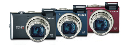
This article is reviewing the Canon’s PowerShot SX200 IS. Its small size and kick-butt mini power look like they might do the trick for me. I'll need to read into it a bit more to make sure that it does low-light photos well, that is a high-priority for me.
Wednesday, June 2, 2010
Photography Photos - Diary

I'm not the type of person to keep a diary, but I have over the years recorded my changing hair color. I tend to change my hair color periodically whenever I get bored or super-stressed over something or when I need a defining change in my life. The images in between the self-portraits so some of my color inspiration in my life.
Friday, May 28, 2010
Photography Artist - Nick Knight, Inez van Lamsweerde & Vinoodh Matadin, David LaChapelle
Nick Knight is a British photographer and director of SHOWstudio.com. He is known for his personal, experimental vision, resulting in work that exists outside the conventions of fashion photography. - wikipedia
His images are stunning fashion shots. The models are gorgeous, the outfits are intricate, everything is eye-candy. He plays with black a lot. Many images have absolute black to the point that details are removed. Everything about his images just screams, look at me more.
Inez van Lamsweerde and Vinoodh Matadin are a Dutch fashion photographer duo, well known for their work for fashion magazines, advertising campaigns, and for their independent art work. - wikipedia
I am seeing a lot of pretty faces. They are obviously models posing to take a picture. Some are even famous people I recognize. No way I cold ever take these types of shots, but there isn't anything technically inspiring here either.
David LaChapelle is a photographer and video/commercial/film director who works in the fields of fashion, advertising, and fine art photography, and is noted for his surreal, unique and often humorous style. LaChapelle's work has been described as surrealist, grotesque, shocking and ironic. Ingrid Sischy, long-time editor of Interview magazine, has said there are three main aspects to his "strong and individualistic" photography: a sense of humour, political awareness and social awareness. His use of celebrities exaggerates aspects of their personalities and their personal lives. - wikipedia
His work is more interesting than the last artist, but I guess the humor is lost on me. Most of what I see is just plain weird. Some is even a little disturbing.
Thursday, May 27, 2010
Photography Site - Shorpy
Shorpy is a vintage photography blog featuring thousands of high-definition images from the 1850s to 1950s. The site is named after Shorpy Higginbotham, a teenage coal miner who lived 100 years ago.
Looking at these images is really neat. I love how crisp the black and white images are and how they capture so much interesting details. This site is a cool window into the past to see old cars, hair styles, clothing, and their general way of life. The image I'm including is from 1927 and is interesting because it shows that while some things do change over time, many do not.
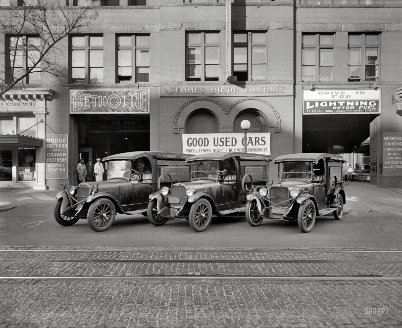
Looking at these images is really neat. I love how crisp the black and white images are and how they capture so much interesting details. This site is a cool window into the past to see old cars, hair styles, clothing, and their general way of life. The image I'm including is from 1927 and is interesting because it shows that while some things do change over time, many do not.
Wednesday, May 26, 2010
Photography Photos - Fashion Story

I was looking forward to doing this set. I wanted to have fun playing pretend "America's Next Top Model" with someone. I actually found a classmate who has modeled before and his hobby is photography so it was an interesting viewpoint to work with him. We focused a little too much time trying to get the image to say something and not enough on the actual clothing, but it was fun none the less.
Friday, May 21, 2010
Photography Artist - Sophie Calle, Nan Goldin
Sophie Calle is a French writer, photographer, installation artist, and conceptual artist. Calle's work is distinguished by its use of arbitrary sets of constraints, and evokes the French literary movement of the 1960s known as Oulipo. Her work frequently depicts human vulnerability, and examines identity and intimacy. She is recognized for her detective-like ability to follow strangers and investigate their private lives. Her photographic work often includes panels of text of her own writing. - wikipedia
Her work has an interesting concept to it, but not many of them are something I'd want to hang on my wall or even use as my desktop background image. I don't really see the art in following someone around recording their life. I think that's actually kind of boring.
Nan Goldin is an American photographer. The main themes of her early pictures are love, gender, domesticity, and sexuality; these frames are usually shot with available light. She has affectionately documented women looking in mirrors, girls in bathrooms and barrooms, drag queens, sexual acts, and the culture of obsession and dependency. The images are viewed like a private journal made public. - wikipedia
Her work seems to be less about the image and more about the action. The pictures aren't pleasant to look at, but she is more focused on documenting what is there. Many of the images are dark or just weird. She did a good job showing us how things are, but not in any way that makes me want to see them.
Thursday, May 20, 2010
Photography Site - Photo Eye
Photo Eye has a magazine and in it I found an interesting article reviewing Edward Burtynsky's Oil. I found the images to be pretty interesting. Its an environmental piece, showing all the bad things in the world, but the images of them are really pretty.
Edward Burtynsky’s impressive book Oil is exquisite with an environmentally difficult narrative portrayed with mesmerizing details in sublimely beautiful photographs. The pages almost glow with the deeply saturated colors. Burtynsky’s Oil trilogy is composed of the industrial production, subsequent consumption and eventually the haunting debris that remains.

Edward Burtynsky’s impressive book Oil is exquisite with an environmentally difficult narrative portrayed with mesmerizing details in sublimely beautiful photographs. The pages almost glow with the deeply saturated colors. Burtynsky’s Oil trilogy is composed of the industrial production, subsequent consumption and eventually the haunting debris that remains.
Wednesday, May 19, 2010
Photography Photos - Constructed Reality

This was the week I was the most looking forward too, but due to a series of unfortunate events, I was not able to take the images I wanted. Its actually super hard to figure out what to shoot. After a long time of brain-wracking, I stumbled upon a book I had about Lily Tomlin's monologue play with lots of great black and white pictures of her. I found a picture frame and then by accident caught the reflection of my hand in the image. I thought that was a cool effect and tried to make my hand emphasize the emotion Lily is portraying in her picture. It was fun.
Friday, May 14, 2010
Photography Artist - Thomas Demand, Gregory Crewdson
Thomas Demand is a German photographer. Thomas Demand is known for making photographs of three-dimensional models that look like real images of rooms and other spaces. The subjects represented in Demand’s photographs often relate to scenes of cultural or political relevance. Because he is working from models, the absence of people in his photographs is conspicuous and thematic. - wikipedia
I think images look lonely and I like them. They look like staged sets and are carefully contrived to portray exactly what is in the image. I like how clean the models look, they look real but still somehow fake. Its fun to look at.
Gregory Crewdson is a leading practitioner in the use of constructed models and staged events in photographic art, which blurs the distinction between reality and fiction. Focusing frequently on the American suburban landscape, his carefully composed and dramatically lit photographs present strangely disquieting views of everyday life that one critic has described as being like a “demented Norman Rockwell.” Crewdson describes himself as an American realist and has said: “I’ve always been interested in the uncanny, in looking into ordinary situations and finding something fantastical or mysterious. I’ve always been interested in domesticity; I’ve always been interested in photographic beauty; and I’ve always been interested in a kind of realism.” - Albright-Knox
Oh my gosh! His images are SUPER cool. They all require a ton of set up, but the image in the end is amazing. They all have a slight creepy edge to them, they feel like time has stopped. Something is always just not quite right in the images, but the people in them don't seem to notice or care. I LOVE IT.
Thursday, May 13, 2010
Photography Site - PDN: Photo District News
PDN: Photo District News has a section dedicated to contests. In my studio class we were recently told to enter design contests because you never know what can happen. Many good people don't win because they simply don't enter. I know my photo work is just in the very early stages but many contests provide feedback. Plus, contests are fun. Their current contest is about fashion. My fashion essay wasn't very strong, but some of my images weren't all that bad, so maybe I'll give it a go. This image is their contest ad image. I think its really pretty with the color palette and how she looks dead. I had tried for a similar theme in my fashion essay, but this is MUCH better.


Wednesday, May 12, 2010
Photography Photos - On The Road

This week happened to fall exactly on the weekend I had planned a trip to Toledo. Also happily, I was not driving so I was able to take lots of good snaps while on the road and over the weekend during my camping trip. I tried to include only the images that really said 'road trip' to me, so the camping has been left out. Most of that weekend was cold and windy, so it make for interesting cloud and sky pictures.
Friday, May 7, 2010
Photography Artist - Stephen Shore, Lee Friedlander, Rudy Dijkstra
Stephen Shore is an American photographer known for his deadpan images of banal scenes and objects in the United States, and for his pioneering use of color in art photography. Shore embarked on a series of cross-country trips, making "on the road" photographs of American and Canadian landscapes. In 1972, he made the journey from Manhattan to Amarillo, Texas, that provoked his interest in color photography. Viewing the streets and towns he passed through, he conceived the idea to photograph them in color. - wikipedia
His images are interesting, but nothing inspiring for me personally. They portray dusty, worn down old America. The colors are interesting because that's half of what is giving that feeling.
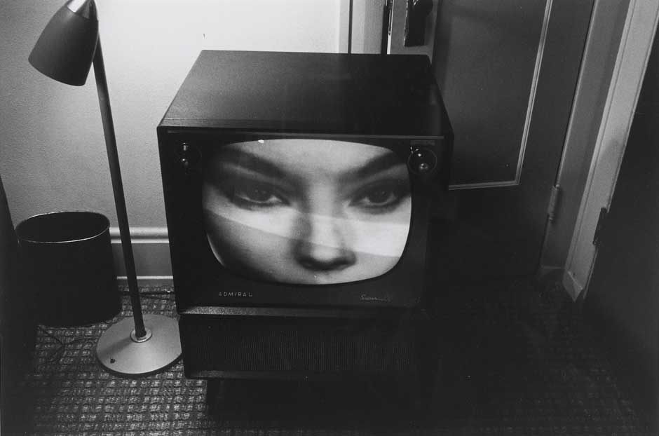
Lee Friedlander is an American photographer and artist. Friedlander's style focused on the "social landscape". His art used detached images of urban life, store-front reflections, structures framed by fences, and posters and signs all combining to capture the look of modern life. - wikipedia
These image are much more interesting to me. The black and white is dramatic, but its the unique points of view for each image that I find so interesting. He captures mirrors and shadows and tv screens when they are the most interesting. I particularly like his work Florida (with sexy eyes), 1963.
Rudy Vanderlans is a Dutch type and graphic designer and the co-founder of Emigre, an independent type foundry. In 1984, VanderLans, with his wife Zuzana Licko, founded Emigre and began to publish Emigregraphic magazine, a journal for experimental design. - wikipedia
The images that Google pulls up from a 'Rudy Vanderlans' search are mostly bright colors and text layouts. I respect graphic designers, but I don't have much interesting in becoming one. I couldn't seem to find much of his pure photographic work, so I don't think I've got a good feel for him.
His images are interesting, but nothing inspiring for me personally. They portray dusty, worn down old America. The colors are interesting because that's half of what is giving that feeling.
Lee Friedlander is an American photographer and artist. Friedlander's style focused on the "social landscape". His art used detached images of urban life, store-front reflections, structures framed by fences, and posters and signs all combining to capture the look of modern life. - wikipedia
These image are much more interesting to me. The black and white is dramatic, but its the unique points of view for each image that I find so interesting. He captures mirrors and shadows and tv screens when they are the most interesting. I particularly like his work Florida (with sexy eyes), 1963.
Rudy Vanderlans is a Dutch type and graphic designer and the co-founder of Emigre, an independent type foundry. In 1984, VanderLans, with his wife Zuzana Licko, founded Emigre and began to publish Emigregraphic magazine, a journal for experimental design. - wikipedia
The images that Google pulls up from a 'Rudy Vanderlans' search are mostly bright colors and text layouts. I respect graphic designers, but I don't have much interesting in becoming one. I couldn't seem to find much of his pure photographic work, so I don't think I've got a good feel for him.
Thursday, May 6, 2010
Photography Site - Outdoor Photographer
Outdoor Photographer has an interesting article about macro shots by Mike Moats. The article is short and sweet and gives actual numbers for f-stops if you'd like to duplicate his techniques. I'd really like to get a better camera and try some of these things. Really small details are fascinating. I really liked his super in focus image of a leaf.

The colors are really pretty and the stem detail is neat to look at. Lots of little things when blown up larger are neat to look at. I'll definitely be coming back to this article when I get a better camera.
The colors are really pretty and the stem detail is neat to look at. Lots of little things when blown up larger are neat to look at. I'll definitely be coming back to this article when I get a better camera.
Subscribe to:
Comments (Atom)