
Tuesday, November 30, 2010
DesComm - Housewares Design
Assignment: Design an innovative product or experience that brings a popular food trend into the home kitchen. It could be a professional technique, a cultural food trend, or an environmental improvement. The design can refine an existing product or be something completely new to the kitchen environment. It should be portable and consider both functionality and aesthetics in its execution. Read the complete rules at the IHA website.

DesComm - Blogging
Assignment: Evaluate the use of a blog as a communication tool about design.
I've enjoyed using a blog as a way of communicating with my peers. Its interesting to read their opinions on things and see where they are coming from on stuff. I like that we all post our projects online for each other to see. As for changing the world with our ideas, I don't think we are there yet, but you have to start somewhere. This format gives us practice at getting our thoughts across. I also really like that with a blog I have the ability to do the assignment when I have the time. Sometimes my class schedule just gets packed down and I would have a hard time squeezing in a free writing assignment. This format allows me to do them when I've got a few minutes waiting for something or carve out a larger time to do them all. I feel like I'm able to put more thought into them because they aren't due on a certain day at a time. I hope my classes in the future continue to use blogs as a presentation or recording format.
I've enjoyed using a blog as a way of communicating with my peers. Its interesting to read their opinions on things and see where they are coming from on stuff. I like that we all post our projects online for each other to see. As for changing the world with our ideas, I don't think we are there yet, but you have to start somewhere. This format gives us practice at getting our thoughts across. I also really like that with a blog I have the ability to do the assignment when I have the time. Sometimes my class schedule just gets packed down and I would have a hard time squeezing in a free writing assignment. This format allows me to do them when I've got a few minutes waiting for something or carve out a larger time to do them all. I feel like I'm able to put more thought into them because they aren't due on a certain day at a time. I hope my classes in the future continue to use blogs as a presentation or recording format.
Monday, November 29, 2010
Typography - Poster Project
Assignment: Create a 16 × 20 inch poster for the MidPoint Music Festival 20XX in Cincinnati. The text and the MPMF graphic identity assets are provided on the class workspace. Carefully consider the typographic hierarchy of the information presented. A viewer should be able to easily understand the calendar of events and to quickly learn who the featured performing acts are. The poster must also convey the excitement of contemporary indie and art rock to an audience of designers and students. The information itself must constitute the “imagery” of the poster. Your poster must be purely typographic. You may use colors, shapes, and lines as well as text, but no illustrations or photography.
Our class didn't get to this project this quarter, but I wanted to keep the assignment included so I might come back to it at some point. The examples were all really cool.
Our class didn't get to this project this quarter, but I wanted to keep the assignment included so I might come back to it at some point. The examples were all really cool.
Tuesday, November 23, 2010
DesComm - Personal Evaluation
Assignment: Evaluate your work this quarter and list your goals for the next quarter.
I believe I've improved my skill set and my work has been good. It's definitely not the best in the class, but I hold my own. I've got plenty of room to grow and peers to look up to.
Next quarter is winter quarter and I'll be on co-op with Swimways. My goals for then are to learn all I can about chairs. Spring quarter's project is the famous Chair Project so I want to hit the ground running. Swimways is looking to expand their camping line, so hopefully I'll get some useful knowledge about chairs and other foldable, portable furniture. I also want to update my website and portfolio to include this quarter's projects. I'm quite proud of both my Baby Food Processor and my main studio project. As a general goal, I want to get even better at Photoshop and Illustrator, and page layouts, and of course, sketching.
Monday, November 22, 2010
Typography - Specimen Sheet
Assignment: Typeface designers have a long-standing tradition of creating “specimen sheets” of their new fonts so printers and designers can see them in action. A good specimen sheet shows the flexibility and expressive range of the typeface family while capturing its distinct spirit and tone of voice. A good specimen sheet also highlights the most unique functional aspects of the face and displays its full range of weights, styles, characters, and special glyphs in a wide range of sizes.
Create two 11 × 17 specimen sheets for one of the following typeface families: Gill Sans Std, Sabon LT Std, Helvetica Neue LT Std, Baskerville Ten OT, Futura Std, Clarendon LT Std, or Bodoni Std (all provided). The first specimen sheet must include: (1) the “style block” with many styles and weights represented and labeled. Keep in mind that the “style block” should utilize some kind of related text, like a quotation or poem, or a set of words that surround a topic relevant to the typeface’s character or purpose. It is a chance for the specimen designer to show off personal style, topical knowledge, or aesthetic taste. The second specimen sheet must include: (2) the full character set including ligatures, lining & oldstyle figures, small capitals, and (3) a sample text set at several sizes, weights, and line spacings (see examples below).
This assignment shows what can be done with just a single font. I decided to use Times New Roman because I absolutely hate the way it looks. This exercise show all the different way the font can look and I like most all there options I came up with. I used bold, italics, small caps, all caps, and narrow width in various combination. I considered using wide as well but I already had enough variables to do the entire poem without repeating anything. I found I really like how the all caps and the small caps lines look, they are very formal. The italics look almost fun and a tad playful in this font. I still really don't care for the normal plain version of the font, but it was an interesting exercise. I'll remember that changing these attributes really changes the font next time I'm looking for that perfect font for a project.

Thursday, November 18, 2010
DesComm - Open Post
Assignment: Write about whatever you want relating to home, school, work experiences, or something else that could be applied to design.
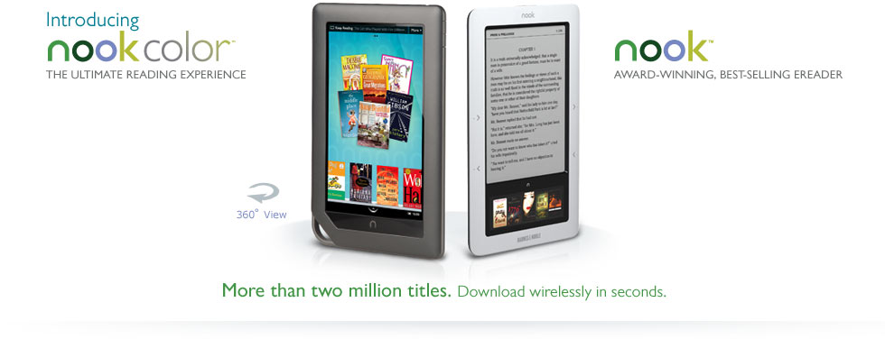
Recently, Barnes and Nobels has come out with a new Nook. It features a full color touch screen. About six months ago, I bought a Nook. I weighed all the pros and cons between it and the Kindle. I found I liked the touch screen at the bottom far more than the full keyboard the Kindle has. Full keyboards should be on devices used for typing, e-readers are for reading. The touch screen has more options available for it, and I liked that it was in color and could show me the book covers.
Since then I bought a new phone, an HTC Incredible, a touch screen droid smart phone. Now when I use my Nook I find myself touching the screen expecting it to react like my phone. It doesn't. It has buttons. Now with the new Nook out, I'm kinda jealous and almost resenting the fact that I didn't wait just a little longer. I really don't want two Nooks, but the new fancy version is so pretty.
One of the reasons I liked the Nook was because I could load my portfolio on to it and could show it to anyone I randomly bumped into that wanted to see what I do. My Nook is in 16 shades of black and white. I work in color. My Nook cost me $200, I can't justify buying the new one unless there is something wrong with this one. Though, maybe I can give it to my mom for Christmas?
Tuesday, November 16, 2010
DesComm - Interview
Assignment: Ask a professional designer for advice. Post a short, 3 question email interview with a professional designer.
I've emailed one of my co-workers from Hasbro Games, Michelle Duval, and am waiting on her responses to these questions:
1. How has your industry changed over the years?
2. What advice would you give to someone just starting out?
3. Tell me about 'your lucky break' or when you finally made it.
I've emailed one of my co-workers from Hasbro Games, Michelle Duval, and am waiting on her responses to these questions:
1. How has your industry changed over the years?
2. What advice would you give to someone just starting out?
3. Tell me about 'your lucky break' or when you finally made it.
Monday, November 15, 2010
Typography - Grid Text
Assignment: A typographic grid organizes text and images across the pages of a document. A grid can consist of a single column framed by margins, or it may have multiple columns. When you design a grid, you typically begin with vertical divisions (columns), and then add horizontal divisions called flow lines that arrange elements at consistent heights throughout a document.
Your page size is 8 × 8 inches. Create a grid with 1/4 inch margins all around and four vertical columns, 1/4 inch gutters. Arrange the provided text on the grid. Create three different designs on three different pages, all using the same underlying grid. You must use only Helvetica Neue 55 Roman. Do two layouts using 8-pt type only, and one layout that introduces one additional size of type.
For this assignment, I created the grid and then just used the spaces in it for the text. The first one I just put everything in the center. The headings got a bit more spacing so you could read them at a glance. The second one I toyed around with using the gutters in between the columns instead. The amount of space was just enough for one line of text so I duplicated that down the page with the rest of the paragraphs. The lines are too long to comfortably read, but it was an interesting idea. For the third one I realized I had used one column for the first and three for the second, so I made a two column text box for the last one. The lines might still be a tad too long, but it works better than the second. I don't like how close the text is to the top and bottom of the page, but that couldn't be helped while staying within the grid system.


Tuesday, November 9, 2010
DesComm - Review Goals
Assignment: Review your goals from the beginning of the quarter and evaluate your progress before the final assignment.
Goal 1: Get a Job
Mission accomplished. I'm going to Swimways. They are in Virginia Beach and they make pool tools and camping gear.
Goal 2: Get better at sketching
'Better' is a relative term, but I think I actually did it this time. I switched over to using a mechanical colored pencil instead of a Verathin, and my line work has improved. My teacher always got on my case about not keeping my pencil sharper. Instead of trying to fix my bad habit (which I tried for the last year without success) I changed tools and the mechanical pencil keeps my lines sharp. Having lines and drawings that aren't all fuzzy and awful looking has given me the motivation to put more effort into the care of my drawings. It's not a giant improvement, but its a step in the right direction.
Goal 3: Learn more about Graphic Design
Done. The Graphics Design Basics 101 class that also required a blog and it's entries are interspersed throughout this one has taught me more about how graphic designers approach things and I've gotten a peak at their window of the world. I'd love to keep learning about it, only because I know everything I present will be better if I know about type and layout.
Goal 4: Good looking resume/portfolio/final presentation
Also done. I like my resume now. Its easy to scan quickly and its pretty. My portfolio has also taken a large step forward. I feel like it has aged up from underclassman to upperclassman. There are fewer projects included but they are all explained more in depth. This helps make it look less like the picture book version I had before. As for my final presentation, I'm still hopeful!
Monday, November 8, 2010
Typography - Word Layouts
Assignment: Choose two words from the list below. In two different compositions, arrange each word to express its meaning (one word per composition). The composition is 6 × 6 inches square. You may vary the size, spacing, placement, and orientation of the letters. You may execute your project by tracing letters, cutting and pasting photocopied letters, using a computer, or any combination of these methods. Use only the typeface Futura Bold (provided on class website). You may repeat, omit, slice, block, or overlap words or letters. Do not use drop shadows or horizontal / vertical scaling (distortion). Do not use anything but black and white letter forms: no color, extraneous shapes, lines, or imagery. Consider the entire space of the square.
Of the words provided, I decided to work with the few that really jumped out at me as actionable words. I liked addition and the T in the word quickly looked like a plus sign to me so that was easy. At first I wasn't sure if I wanted to make it a + or just leave it a t, but in the end I figured it read better that way. Also, I added symbols to the word to get its meaning across. For elimination, I immediately noticed that there were a lot of I's in that word. The dots were an interesting aspect so I worked with taking them out, leaving them half in until I got something I thought looked neat.


Assignment: Within a 6 × 6 inch square, compose the text provided below in a manner that expresses its meaning. Use only the roman, italic, and small caps of Sabon (provided on website). Vary only alignment, leading, line length, orientation, and spacing. Use no variations in weight or size. You may break the paragraph into smaller elements and distribute them within the square.
This was a harder assignment, I wasn't really sure what I was going to do with it for a while. Eventually, I just broke the paragraph up into bits and then divided the parts about handwriting from printing. Hand writing stuff I italicized and the printed stuff I left regular. Then I worked with the alignments to visually describe what the words were saying.

Thursday, November 4, 2010
DesComm - Post Project
Assignment: Create sketch renderings that utilize 2D & 3D tools for impact and efficiency. Choose a final direction for your flash drive project and create rough models in Alias or Solidworks. Using screenshots as an underlay, use 2D tools to sketch over the models, add details, and simulate materials. Carefully choose which details are best modeled in 3D and which should be left to add later in Photoshop. Excellent concepts will evenly and appropriately utilize 2D and 3D tools to maximize the impact of the rendering in terms of accuracy, contrast, and composition. Share your mixed media renderings and discuss the challenges and successes in your work.


I had a real challenge with trying to make my sketch render look sketchy and early without making it look crappy. I'm not so sure how well I did that. I'm not real happy with how the sketchy one turned out but I'm darn pleased of the Photoshop one. I need to work on making it more dramatic though. There isn't much technically space to improve, but I can definitely do better with the style. Irena says gradient greyscale backgrounds and irrelevant swoopy lines. I don't know, but maybe. I've included the image I started from for reference.


I had a real challenge with trying to make my sketch render look sketchy and early without making it look crappy. I'm not so sure how well I did that. I'm not real happy with how the sketchy one turned out but I'm darn pleased of the Photoshop one. I need to work on making it more dramatic though. There isn't much technically space to improve, but I can definitely do better with the style. Irena says gradient greyscale backgrounds and irrelevant swoopy lines. I don't know, but maybe. I've included the image I started from for reference.
Tuesday, November 2, 2010
DesComm - Strengths
Assignment: Write about your individual strengths as a designer and how you stay focused on them.
I believe my strengths as a designer is my ability to look objectively at a problem and figure out what needs to be addressed in the final solution. I'm a strong problem solver and its one of my interests to read up about new materials and processes. This extra knowledge comes in handy when looking at problems in new ways.
I keep this skill of mine sharp by always looking around for things that have longstanding problems that people just seem to accept. One of my favorite commercial tag lines is from Dyson Vacuum Cleaners. "We fix the obvious problems others seem to ignore." That really resonates with me. If there is a problem, there has to be a better way of doing it. Then I start thinking about what would be better. Its a game I play in the back of my head constantly. The downside of this makes me come off as being overly critical and negative. I'm really not negative, but I do agree with being critical.
Monday, November 1, 2010
Typography - 9 Square Letters
Assignment: Using 9-Square grids, explore the use of image and letter forms to convey mood, spatial ambiguity, dynamic composition, and pattern. The grid template is used to organize cuts made from magazine prints into orderly arrangements that display an intentional use of the frame to subtract unnecessary detail and focus the viewer on elements in a considered way.
Arrange magazine letterform cuts in the grid such that positive-negative spatial relationships between the letterforms and the frames themselves become ambiguous. Work in black and white. Try to make it unclear whether it is a white letterform on a black field or a black letter form in a white field. Determine how much of the letter can be cut away and still have just enough left for recognition.
For this assignment, I focused less on making the letters look ambiguous and more on making the letters flow into each other and relate. I really like the thin and thick lines used in the A and the H. The angle of the A was mirrored in the B. The letters in the lower right were all arranged to seamlessly connect to each other so that its a bit hard to tell where the J becomes the K becomes the Q becomes the S and ends at the B. I feel that there is a bit of disconnect between the first 5 and the last 4, but I liked both halves to much to change either. I probably should have broken them apart and done two separate ones based on those bits. Maybe next time.

Subscribe to:
Comments (Atom)