Friday, May 28, 2010

Photography Artist - Nick Knight, Inez van Lamsweerde & Vinoodh Matadin, David LaChapelle

Nick Knight is a British photographer and director of SHOWstudio.com. He is known for his personal, experimental vision, resulting in work that exists outside the conventions of fashion photography. - wikipedia

His images are stunning fashion shots. The models are gorgeous, the outfits are intricate, everything is eye-candy. He plays with black a lot. Many images have absolute black to the point that details are removed. Everything about his images just screams, look at me more.


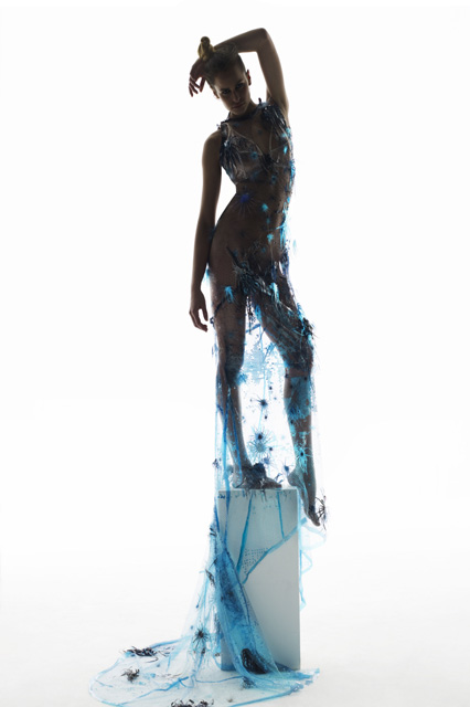
Inez van Lamsweerde and Vinoodh Matadin are a Dutch fashion photographer duo, well known for their work for fashion magazines, advertising campaigns, and for their independent art work. - wikipedia

I am seeing a lot of pretty faces. They are obviously models posing to take a picture. Some are even famous people I recognize. No way I cold ever take these types of shots, but there isn't anything technically inspiring here either.

David LaChapelle is a photographer and video/commercial/film director who works in the fields of fashion, advertising, and fine art photography, and is noted for his surreal, unique and often humorous style. LaChapelle's work has been described as surrealist, grotesque, shocking and ironic. Ingrid Sischy, long-time editor of Interview magazine, has said there are three main aspects to his "strong and individualistic" photography: a sense of humour, political awareness and social awareness. His use of celebrities exaggerates aspects of their personalities and their personal lives. - wikipedia

His work is more interesting than the last artist, but I guess the humor is lost on me. Most of what I see is just plain weird. Some is even a little disturbing.

Thursday, May 27, 2010

Photography Site - Shorpy

Shorpy is a vintage photography blog featuring thousands of high-definition images from the 1850s to 1950s. The site is named after Shorpy Higginbotham, a teenage coal miner who lived 100 years ago.

Looking at these images is really neat. I love how crisp the black and white images are and how they capture so much interesting details. This site is a cool window into the past to see old cars, hair styles, clothing, and their general way of life. The image I'm including is from 1927 and is interesting because it shows that while some things do change over time, many do not.

Wednesday, May 26, 2010

Photography Photos - Fashion Story


I was looking forward to doing this set. I wanted to have fun playing pretend "America's Next Top Model" with someone. I actually found a classmate who has modeled before and his hobby is photography so it was an interesting viewpoint to work with him. We focused a little too much time trying to get the image to say something and not enough on the actual clothing, but it was fun none the less.

Friday, May 21, 2010

Photography Artist - Sophie Calle, Nan Goldin

Sophie Calle is a French writer, photographer, installation artist, and conceptual artist. Calle's work is distinguished by its use of arbitrary sets of constraints, and evokes the French literary movement of the 1960s known as Oulipo. Her work frequently depicts human vulnerability, and examines identity and intimacy. She is recognized for her detective-like ability to follow strangers and investigate their private lives. Her photographic work often includes panels of text of her own writing. - wikipedia

Her work has an interesting concept to it, but not many of them are something I'd want to hang on my wall or even use as my desktop background image. I don't really see the art in following someone around recording their life. I think that's actually kind of boring.

Nan Goldin is an American photographer. The main themes of her early pictures are love, gender, domesticity, and sexuality; these frames are usually shot with available light. She has affectionately documented women looking in mirrors, girls in bathrooms and barrooms, drag queens, sexual acts, and the culture of obsession and dependency. The images are viewed like a private journal made public. - wikipedia

Her work seems to be less about the image and more about the action. The pictures aren't pleasant to look at, but she is more focused on documenting what is there. Many of the images are dark or just weird. She did a good job showing us how things are, but not in any way that makes me want to see them.

Thursday, May 20, 2010

Photography Site - Photo Eye

Photo Eye has a magazine and in it I found an interesting article reviewing Edward Burtynsky's Oil. I found the images to be pretty interesting. Its an environmental piece, showing all the bad things in the world, but the images of them are really pretty.

Edward Burtynsky’s impressive book Oil is exquisite with an environmentally difficult narrative portrayed with mesmerizing details in sublimely beautiful photographs. The pages almost glow with the deeply saturated colors. Burtynsky’s Oil trilogy is composed of the industrial production, subsequent consumption and eventually the haunting debris that remains.

Wednesday, May 19, 2010

Photography Photos - Constructed Reality


This was the week I was the most looking forward too, but due to a series of unfortunate events, I was not able to take the images I wanted. Its actually super hard to figure out what to shoot. After a long time of brain-wracking, I stumbled upon a book I had about Lily Tomlin's monologue play with lots of great black and white pictures of her. I found a picture frame and then by accident caught the reflection of my hand in the image. I thought that was a cool effect and tried to make my hand emphasize the emotion Lily is portraying in her picture. It was fun.

Friday, May 14, 2010

Photography Artist - Thomas Demand, Gregory Crewdson

Thomas Demand is a German photographer. Thomas Demand is known for making photographs of three-dimensional models that look like real images of rooms and other spaces. The subjects represented in Demand’s photographs often relate to scenes of cultural or political relevance. Because he is working from models, the absence of people in his photographs is conspicuous and thematic. - wikipedia

I think images look lonely and I like them. They look like staged sets and are carefully contrived to portray exactly what is in the image. I like how clean the models look, they look real but still somehow fake. Its fun to look at.


Gregory Crewdson is a leading practitioner in the use of constructed models and staged events in photographic art, which blurs the distinction between reality and fiction. Focusing frequently on the American suburban landscape, his carefully composed and dramatically lit photographs present strangely disquieting views of everyday life that one critic has described as being like a “demented Norman Rockwell.” Crewdson describes himself as an American realist and has said: “I’ve always been interested in the uncanny, in looking into ordinary situations and finding something fantastical or mysterious. I’ve always been interested in domesticity; I’ve always been interested in photographic beauty; and I’ve always been interested in a kind of realism.” - Albright-Knox


Oh my gosh! His images are SUPER cool. They all require a ton of set up, but the image in the end is amazing. They all have a slight creepy edge to them, they feel like time has stopped. Something is always just not quite right in the images, but the people in them don't seem to notice or care. I LOVE IT.

Thursday, May 13, 2010

Photography Site - PDN: Photo District News

PDN: Photo District News has a section dedicated to contests. In my studio class we were recently told to enter design contests because you never know what can happen. Many good people don't win because they simply don't enter. I know my photo work is just in the very early stages but many contests provide feedback. Plus, contests are fun. Their current contest is about fashion. My fashion essay wasn't very strong, but some of my images weren't all that bad, so maybe I'll give it a go. This image is their contest ad image. I think its really pretty with the color palette and how she looks dead. I had tried for a similar theme in my fashion essay, but this is MUCH better.

Packaging Studio - Storyboarding of Product Life Stages


Wednesday, May 12, 2010

Photography Photos - On The Road


This week happened to fall exactly on the weekend I had planned a trip to Toledo. Also happily, I was not driving so I was able to take lots of good snaps while on the road and over the weekend during my camping trip. I tried to include only the images that really said 'road trip' to me, so the camping has been left out. Most of that weekend was cold and windy, so it make for interesting cloud and sky pictures.

Friday, May 7, 2010

Photography Artist - Stephen Shore, Lee Friedlander, Rudy Dijkstra

Stephen Shore is an American photographer known for his deadpan images of banal scenes and objects in the United States, and for his pioneering use of color in art photography. Shore embarked on a series of cross-country trips, making "on the road" photographs of American and Canadian landscapes. In 1972, he made the journey from Manhattan to Amarillo, Texas, that provoked his interest in color photography. Viewing the streets and towns he passed through, he conceived the idea to photograph them in color. - wikipedia

His images are interesting, but nothing inspiring for me personally. They portray dusty, worn down old America. The colors are interesting because that's half of what is giving that feeling.

Lee Friedlander is an American photographer and artist. Friedlander's style focused on the "social landscape". His art used detached images of urban life, store-front reflections, structures framed by fences, and posters and signs all combining to capture the look of modern life. - wikipedia

These image are much more interesting to me. The black and white is dramatic, but its the unique points of view for each image that I find so interesting. He captures mirrors and shadows and tv screens when they are the most interesting. I particularly like his work Florida (with sexy eyes), 1963.


Rudy Vanderlans  is a Dutch type and graphic designer and the co-founder of Emigre, an independent type foundry. In 1984, VanderLans, with his wife Zuzana Licko, founded Emigre and began to publish Emigregraphic magazine, a journal for experimental design. - wikipedia

The images that Google pulls up from a 'Rudy Vanderlans' search are mostly bright colors and text layouts. I respect graphic designers, but I don't have much interesting in becoming one. I couldn't seem to find much of his pure photographic work, so I don't think I've got a good feel for him.

Thursday, May 6, 2010

Photography Site - Outdoor Photographer

Outdoor Photographer has an interesting article about macro shots by Mike Moats. The article is short and sweet and gives actual numbers for f-stops if you'd like to duplicate his techniques. I'd really like to get a better camera and try some of these things. Really small details are fascinating. I really liked his super in focus image of a leaf.


The colors are really pretty and the stem detail is neat to look at. Lots of little things when blown up larger are neat to look at. I'll definitely be coming back to this article when I get a better camera.

Wednesday, May 5, 2010

Photography Photos - Portrait


This week was portraits. I had trouble actually finding people I could photograph. This week I experimented with black and white photography. Only two of my images didn't drastically improve with removing the color. To keep things consistent I left them black and white as well. Most of my images show one of my friend's faces between 6" and 2" away. The balance has been pushed to create extra drama. The subjects were not asked to smile and they just arranged their faces as they wanted, adding extra character to the pictures.